Ø5 - Juice
Reinventing Your Data Plan
Verizon came to us with a simple premise - an entirely digital, pay-as-you-go wireless service on Verizon's network.
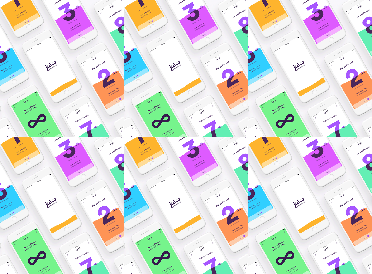
Introducing Juice on Verizon, the first mobile service where you get all the data you need, but only pay for what you use. Juice works around the customer - giving them control over their data right within the Juice app.
Experience Design
Experience Strategy
Motion Design
Verizon

Over the course of 6 months, our team of 30+ built the service from the ground up, totaling over 3,000 screens. Ultimately, Verizon decided that having a separate business wasn’t right at the time. Because Verizon loved the functionality and design of it, we later worked with Verizon to build the experience directly into the Verizon.com site.
I worked on Juice from the initial concept direction to final delivery as an experience and motion designer, then joined the team redeveloping the designs to fit the Verizon.com site.

Juice is your fuel for life. We played with the concept of a flowing amount of fuel, or data that would represent how much data you had used that pay cycle.
View our introduction to Juice:
For the first few weeks of the project, we crafted personas, built user journeys and storyboards, and came up with experience moments. During this time, we explored motion, data visualization, and moments of surprise and delight.

As the project grew and split into several teams, I became a point person for consistency and overarching product structure. To keep the team organized, I built a large user flow covering the whole project, from purchase and activate, to app experience and support. During this time, I helped work on the product roadmap and features.

For the bulk of the project, I was part of the purchase and activate team. This included Sign up, and Shop & Payment on both the web and the app. Working off of user stories, we created flow diagrams, individual screens, and annotations for each feature. We worked directly with client and business analysts for all user stories. Every week, we presented our progress to the larger team of 200+ in Piscataway and heavily tested our designs.
For each sprint, we tackled several features and incorporated them into the system. I created flows for features like device payment plans, trade-ins, referrals, and more.

After initial concepting, the team grew and split into multiple teams. I first focused on the overarching structure of the site and app, then joined the purchase and activate team, where focused on service configuration and sign up. I owned the product design, motion design and prototype for this flow and tested this heavily with users.
Because the purchase funnel would lead users through a complicated flow that would change per individual, I worked on building a flexible nav that would accommodate all combination of steps. This nav would need to show progress and display data, while allowing users to change their flow. I created a system of states for each flow that would show active states, complete states, and incomplete states.
These modules would expand, collapse, appear and disappear based on the user’s answers during the purchase funnel, creating a customized experience that helped place the user in their flow.
With the animation work of the purchase funnel, I helped define the motion specs for Juice. This involved working with other XDs on flows to bring motion to their designs, designing additional motion with an XD perspective, working with visual designers for consistency, distilling motion into single examples for developers, and writing Motion annotations. One flow I focused most on was the offers flow. It involved a set of cards that the user would choose, making the customization of their offers pages a little more fun and involved.
Ultimately, the project was paused just a few days before launch. However, the purchase and activate team work was revamped for Verizon.com. I worked on taking our designs from Juice to create the new experience.

Aside from reworking the flow to fit the Verizon requirements, I worked with the team to redefine brand motion for Verizon.com. While the Juice brand was very playful and springy, Verizon was more refined and elegant.

To help share motion across the team, we abstracted elements across the flow into blocks, which acted as a motion guide for both this project and future Verizon projects.

See the final experience here:
Team:
Gene Perelson, Creative Director
Chelsea McLemore, Creative Director
Nicholas Karlovich, Associate Creative Director
Amelia Hancock, Experience Design Director
Robyn Lambert, Experience Designer
Joseph Oak, Visual Designer
+ many more